Monday, December 3, 2012

Baskin Robbins

Who knew ice cream,the ultimate comfort food, could be edgy? Baskin Robbin's new logo certainly is. Below are the old ones, and then the new one. Same colors, very different type face.


Friday, October 19, 2012

Microsoft

Microsoft's new logo combines a stylized version of the Windows four color box with a crisper, non-italic font. See below for the various transitions, as the type face gets simpler and more elegant.


While we're at it, let's take a look at how the Windows logo has evolved.

Sunday, October 14, 2012

Wendy's

The hamburger chain has a new logo. The previous one had been in use since 1983.
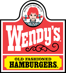


The type face, the swirly design, and the girl's clothes and pig-tails all resonate with the "old fashioned" phrase. Very 19th century, perhaps even Western, frontier looking.

The new logo is modern, but in a casual way.
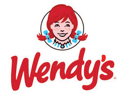


The company's press release notes that having the pigtails go outside of the circle make it more "dynamic". The font change makes a big difference. It looks the way people write these days (part printing, not really cursive) and has a casual, friendly look. The dress style is no longer visible, another way of acknowledging the past while moving forward. All in all, they've successfully tweaked and updated the design.

Monday, October 8, 2012

eBay

Start-up technology companies seem to feel free to have funky names and logos. More established companies move towards sleek, modern design elements. At least that's what I read into eBay's recent logo change from


to

Thursday, September 20, 2012

3M -- two names, four logos

Founded in 1902 as Minnesota Mining and Manufacturing, 3M makes over 55,000 products but has kept its logo history straightforward: the original full name and location logo, and three increasingly modernized versions of  just "3M".

Monday, April 30, 2012

Northwest Airlines


Not much continuity here. However, the last two logos have some clever design elements. If you squint, the capital N and the triangle make a W. Also, the triangle points to the northwest corner of the compass.

Monday, March 19, 2012

United States Postal Service

The eagle remains, but in a very streamlined style. Also note the change in font, which is less easily readable.