Monday, October 31, 2011

Grumman

Grumman Aircraft Engineering Corporation was founded 1929. Later known as Grumman Aerospace Corporation and Grumman Corporation, it merged with Northrop in 1994. Below are a sampling of Grumman's logos from the earliest Art Deco to stripped down (somewhat bizarre)  mid-century modern versions to current. I vote to bring back the bird!


Sunday, October 30, 2011

Some logos have changed remarkably little from their late 19th-early 20th century designs. "If it ain't broke, why fix it?"


There are only slight changes to the "K" and "g"s in the Kellogg's logo.


The font on the current Ford logo is just slightly simplified from the 1912 version.


And finally for an old one that isn't cursive, here is the Du Pont logo.


Saturday, October 29, 2011

Caterpillar


If you see a green and yellow machine in the distance, you know it is a Deere. If it is yellow, it's Caterpillar. Simple as that. In the case of Cat, the yellow is even more essential to the brand image than the logo, in my opinion.


Friday, October 28, 2011

John Deere

2000 logo

Based in Moline, Illinois, Deere's product line has expanded greatly from its origin in farm equipment. The company now makes construction and forestry equipment, motors, all-terrain vehicles, snow plows and lawnmowers.

The logo, while it has been tweaked and modernized, has actually changed remarkably little.

1876 logo
The first logo from 1876 shows the leaping deer with the company's name in a somewhat ornate type face. The 1937 logo has simplified the deer's outline.
1937 logo
The 1956 version has a crisper sans-serif type face and the deer is leaping in mid-air instead of over a log.


 The deer is in the current version is at the beginning of his jump, rather than landing.

There is a very good history of the logo on the company's web site. http://www.deere.com/wps/dcom/en_US/corporate/our_company/about_us/history/trademarks/trademarks.page

The company has done an excellent job of linking the yellow and green colors to its brand image. The colors are consistent (green body, yellow wheels) on every product, including kid's toys.


Monday, October 24, 2011

Pepsi vs. Coke

No, this isn't about which one you drink. No one can ever change your mind, I understand that. It's about change in logos and, specifically, fonts.

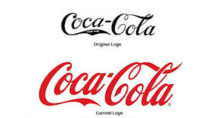
Coca-Cola's logo has changed very little over the decades, and the font hardly at all.


Pepsi's logo has changed repeatedly, each time the font getting simpler.


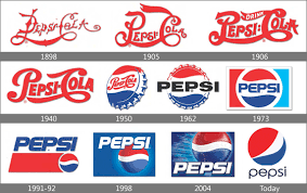
The most recent logo has generated a lot of cartoon humor, not exactly what the company had in mind, I would guess.

 
I recently noticed "throwback" cans of Pepsi.


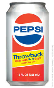
Perhaps they are going to bring back the old logo and the new "throwback" cans are a marketing test. Or maybe it's because Coca Cola has been importing "Mexican Coke", which is also made with real sugar. It makes me ponder this important question: which is more important, logos or sugar?


Wednesday, October 19, 2011

Boeing

Boeing's logo has changed dramatically over the years from the early Art Deco bird designs to mid-century modern to incorporating the McDonnell Douglas logo after the merger.

The early logos used birds to symbolize the new joy of flight, as did the logos of many other early aircraft manufacturers.


The "flying totem pole" motif also reflects the company's Pacific Northwest roots. It was used from the 1940s to the 1960s when the new simplified logo was introduced.

In 1997, Boeing merged with McDonnell Douglas.

The McDonnell Douglas Logo. A simplified version was added to the Boeing typeface following the merger

Thirty years earlier McDonnell Aircraft had merged with the Douglas Aircraft Companyand kept the Douglas "flight around the world" motif in the combined companies logo.

Mcdonnell-logo.png   Douglas-logo.png

The current Boeing logo has a modified version of the Douglas design as well that is in keeping with its crisp font style.


Boeing has a good page on its website showing the logo designs: http://www.boeing.com/news/releases/1997/histlogo.htm

Thursday, October 13, 2011

Union Pacific Railroad (Part 2)

I hope you've had a chance to look at the Union Pacific website showing the history of its own logos. Fantastic information!

Now, back to tracing the companies that joined together to make up the current system.

In 1980, the Missouri Pacific Railroad was acquired, the Western Pacific in 1983, and the Missouri, Kansas, Texas (known as Katy in 1988).


Logo
Missour Pacific logo


Logo
Western Pacific logo
Logo
Two versions of the Missouri, Kansas Texas l
  

In 1984, Southern Pacific merged with Santa Fe Industries, parent of the Atchison, Topeka and Santa Fe.

The Southern Pacific rail assets were subsequently sold to Union Pacific while the Santa Fe became part of Burlington Northern. Ironically, Union Pacific had also owned the Southern Pacific from 1901 to 1913 when the Supreme Court required divestiture.


Logo
Atchison, Topeka Santa Fe logo
Logo
Southern Pacific logo

The Chicago and North Western line was acquired in 1995. It had previously acquired other Midwest railroads including the Chicago Great Western and the Minneapolis and St. Louis Railway. Their logos are shown below.

Logo   Logo   Logo

All of the logos fit within the square/circular format that works well on the front of the locomotive.