Wednesday, March 27, 2013
Forest products companies
Many, but not all, forest products companies show a stylized tree in their logos. Nice graphics, good product representation -- but I'm not sure exactly what kind of trees they are! Pines, maybe?



Sunday, March 24, 2013
Where in the world is...? Matthews Asia Funds and Goldwater's Department Stores
Not many logos answer the "where" question. Two come to mind.

Not only is the dragon gorgeous, but it also clearly reflects Matthews' geographic investment specialty.
(Note: according to folklore, Chinese dragons have five toes while Japanese ones have four. This one is artistically ambiguous.)

This logo of a department store chain that no longer exists as a separate organization combines a crisp, clear design with a very specific reference to "place". What could say Arizona more than sun and saguaro cactus? I've mentioned this one before: http://logosandotherdistractions.blogspot.com/2011/11/goldwaters-department-store.html
Matthews Asia Funds
Not only is the dragon gorgeous, but it also clearly reflects Matthews' geographic investment specialty.
(Note: according to folklore, Chinese dragons have five toes while Japanese ones have four. This one is artistically ambiguous.)
Goldwater's Department Stores
This logo of a department store chain that no longer exists as a separate organization combines a crisp, clear design with a very specific reference to "place". What could say Arizona more than sun and saguaro cactus? I've mentioned this one before: http://logosandotherdistractions.blogspot.com/2011/11/goldwaters-department-store.html
Saturday, December 22, 2012
University of California
It turns out that some people like certain logos and not other ones. In fact, college students in particular seem to care a lot. The University of California tried to change its logo,
"students, alumni and other members of our community" protested and the university back down.
http://www.mercurynews.com/education/ci_22193363/statement-from-uc-official-announcing-new-logo-has?source=pkg
"students, alumni and other members of our community" protested and the university back down.
http://www.mercurynews.com/education/ci_22193363/statement-from-uc-official-announcing-new-logo-has?source=pkg
Monday, December 3, 2012
Baskin Robbins
Who knew ice cream,the ultimate comfort food, could be edgy? Baskin Robbin's new logo certainly is. Below are the old ones, and then the new one. Same colors, very different type face.


Friday, October 19, 2012
Microsoft
Microsoft's new logo combines a stylized version of the Windows four color box with a crisper, non-italic font. See below for the various transitions, as the type face gets simpler and more elegant.
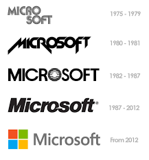
While we're at it, let's take a look at how the Windows logo has evolved.
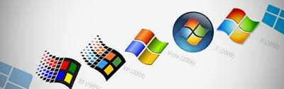
While we're at it, let's take a look at how the Windows logo has evolved.
Sunday, October 14, 2012
Wendy's
The hamburger chain has a new logo. The previous one had been in use since 1983.
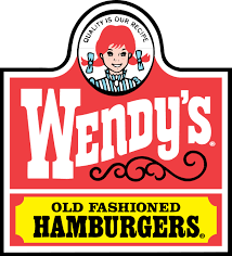
The type face, the swirly design, and the girl's clothes and pig-tails all resonate with the "old fashioned" phrase. Very 19th century, perhaps even Western, frontier looking.
The new logo is modern, but in a casual way.
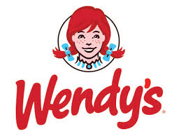
The company's press release notes that having the pigtails go outside of the circle make it more "dynamic". The font change makes a big difference. It looks the way people write these days (part printing, not really cursive) and has a casual, friendly look. The dress style is no longer visible, another way of acknowledging the past while moving forward. All in all, they've successfully tweaked and updated the design.
The type face, the swirly design, and the girl's clothes and pig-tails all resonate with the "old fashioned" phrase. Very 19th century, perhaps even Western, frontier looking.
The new logo is modern, but in a casual way.
The company's press release notes that having the pigtails go outside of the circle make it more "dynamic". The font change makes a big difference. It looks the way people write these days (part printing, not really cursive) and has a casual, friendly look. The dress style is no longer visible, another way of acknowledging the past while moving forward. All in all, they've successfully tweaked and updated the design.
Monday, October 8, 2012
eBay
Start-up technology companies seem to feel free to have funky names and logos. More established companies move towards sleek, modern design elements. At least that's what I read into eBay's recent logo change from

to

to
Subscribe to:
Posts (Atom)