Microsoft's new logo combines a stylized version of the Windows four color box with a crisper, non-italic font. See below for the various transitions, as the type face gets simpler and more elegant.

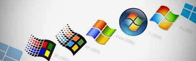
While we're at it, let's take a look at how the Windows logo has evolved.
No comments:
Post a Comment